A+ Tips for Effective Trade Show Exhibits
We love getting great report cards as much as anyone this time of year. And we believe in celebrating success, which is why we’re trumpeting our latest A+ scores like a proud mom on Facebook.
But we also believe in sharing our secrets. Because the effective trade show strategies that earned our client, Crest + Oral-B, such great results at the Chicago Dental Society’s Midwinter Meeting are tactics all exhibitors can learn from.
Here’s what the Exhibiting Effectiveness Evaluation, conducted by Competitive Edge and Trade Shows Plus, had to say about the Crest + Oral-B experience in Chicago, PLUS tips on how you can get similarly great results.
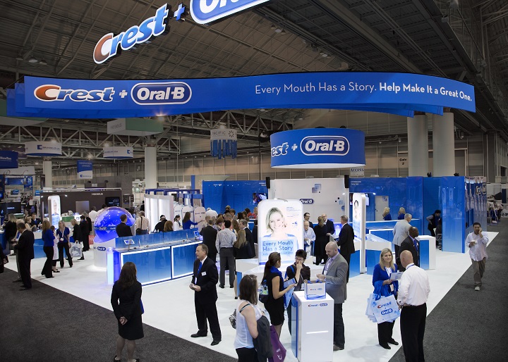
Our booth included a hands-on science demo area, brushing stations for sampling, and a live presentation theater, where two professional presenters delivered a news-themed deep dive into Crest and Oral-B’s latest innovations.
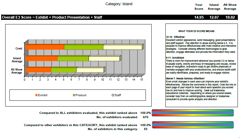
The overall experience scored 100% compared to all other exhibitors at the show.
This category evaluated the general impression the exhibit made on the show floor, and our scores were nearly perfect. Here’s a sampling of comments: “Theme was effective/creative. Good overall exhibit design. Good graphics. Good lighting. Good use of A/V. Creative/Imaginative approach to exhibit/messaging. Wow. Amazing.”
How can you get similar results?
– Invest in good booth design. Create something inviting that brings your brand to life with smart use of equity colors and graphics. But keep it versatile. The goal is to get multiple years of use out of your booth with the ability to switch out themes and change up the experience each year.
– Be bold, and be seen. We can’t stress enough the importance of a big, eye-catching overhead banner, along with branded signage high enough to be seen over other exhibits.
– Don’t skimp on lighting. Even the best-lit convention hall won’t make your exhibit look its best. Good lighting not only helps your investment shine, it actually enhances the experience for your guests.
– Layer in a theme. Since Crest + Oral-B had so many new innovations last season, we carried a news theme throughout the booth. Theming is an extra step that can help you avoid dry, boring presentations and demos.
Product Presentation
Here, our scores were 5s across the board. Comments included: “Theater is Disney-off-the-chart. Product innovation demos are excellent. Staging is incredible.”
How can you get similar results?
– Do a presentation or demo – or both! Of course we love live presentations — they work! And for many products, a demo should be a no-brainer. Here are some ideas for doing them right.
– Be entertaining. But don’t feel pressured to do Disney. Our audiences have come to expect nothing but the best from Crest + Oral-B, so we’re constantly raising the bar on our theater experiences. The real lesson is to incorporate some element of entertainment, whether it simply be multiple monitors, a storytelling approach, or that fun theme we mentioned above.
– Use professional presenters. Giving a great presentation at a corporate meeting is different from engaging and entertaining crowds four times an hour for three days straight. Professional presenters will deliver your message with flair every single time.
Exhibit Staff
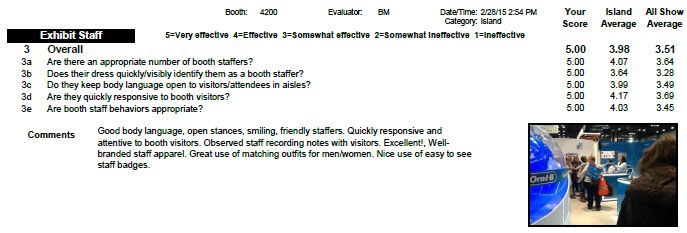
Our scores were A+ here, too. Just look at those comments!
How can you get similar results?
– Go pro. Hire seasoned hosts with the energy and know-how to represent your company with class. Or at least provide your internal team with training on how to be as engaging and helpful as possible on the trade show floor.
– Create a uniform look. Matching shirts, ties, and other clothing items not only make your team look good, they make it easy for guests to figure out whom to approach when they’re ready for a conversation.
The final lesson? With good planning, great staffing, and a touch of entertainment, you can create a more effective trade show exhibit that earns top grades from your target audience. Interested in seeing how MPG can help? Check out our Work and our Services.


